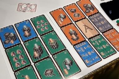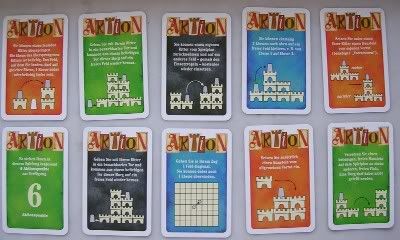

I still much prefer the original design. Don't like scrapping the text and replacing it with a nice but superfluous 3D illustration when the original graphic is still on the upper corners of the card. The menu also has less utility since it's not all graphical with no text. I understand the thrust for being language independent to save on reprinting, but overall this card design is just less efficient.
Torres 2005 will also come in a Tikal-sized box, which is long and flat. I prefer the original package, which is the size of an alea big box game. Much more portable, and fits in a smaller bag. I can live without the colored rules. Now I really feel good about buying Torres 2000. :)
No comments:
Post a Comment